
When working on a side project where I needed to build matching Android and iOS native apps, I wanted to learn both SwiftUI and Jetpack Compose for the UI. I started with the iOS app using SwiftUI and then moved to Android with Jetpack Compose. Along the way, I realized how helpful it would have been to have a cheat sheet that compares the different elements in both frameworks.
In this article, I’ll walk you through a comparison of the fundamental components, layouts, and UI elements across SwiftUI and Jetpack Compose to make cross-platform development easier for those already familiar with one of these frameworks. The intent of this article to focus on code, not to be a deep dive for each element with an advanced example of a working CustomButton in both.
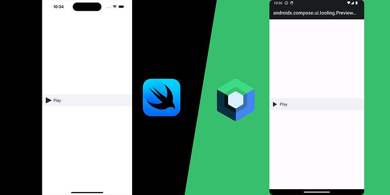
Preview
Before we get started, if you’re familiar with one framework, heres a quick table of the equivalents of the commonly used components.
Basic Structure: SwiftUI vs Jetpack Compose
Both SwiftUI and Jetpack Compose rely on declarative syntax where the UI is a function of the state.
SwiftUI Example
struct ContentView: View {
    @State private var count: Int = 0

    var body: some View {
        VStack {
            Text("Count: \(count)")
            Button(action: { count += 1 }) {
                Text("Increase")
            }
        }
    }
}
Jetpack Compose Example
@Composable
fun ContentView() {
    val count = remember { mutableIntStateOf(0) }

    Column {
        Text("Count: ${count.intValue}")
        Button(onClick = { count.intValue++ }) {
            Text("Increase")
        }
    }
}
In both, the UI is directly influenced by the state of the app (@State in SwiftUI and remember in Jetpack Compose).
Layout Components
VStack and HStack vs Column and Row
In SwiftUI, VStack is used to stack elements vertically, and HStack is used for horizontal stacking. Jetpack Compose equivalents are Column and Row.
SwiftUI Example
VStack {
    Text("Hello")
    Text("World")
}

HStack {
    Text("Hello")
    Text("World")
}
Jetpack Compose Example
Column {
    Text("Hello")
    Text("World")
}

Row {
    Text("Hello")
    Text("World")
}
Whether you’re stacking elements vertically (VStack in SwiftUI or Column in Jetpack Compose) or horizontally (HStack and Row), the process is very similar. Once I got used to these equivalents, it became much easier to navigate between both platforms.
Common UI Components: Buttons, TextFields, and Images
Buttons
Both frameworks use similar approaches for buttons. Here’s how the equivalent components line up:
SwiftUI Button
Button(action: {
    print("Button pressed")
}) {
    Text("Press Me")
}
Jetpack Compose Button
Button(onClick = {
    println("Button pressed")
}) {
    Text("Press Me")
}
TextFields
Handling user input is central to most apps. SwiftUI and Jetpack Compose both offer input components with minor syntax differences.
SwiftUI TextField
@State private var text: String = ""
TextField("Enter text", text: $text)
Jetpack Compose TextField
val text = remember { mutableStateOf("") }
TextField(
    value = text.value,
    onValueChange = { text.value = it },
    label = { Text("Enter text") }
)
Images
Handling images can be done with Image in SwiftUI and Image or Icon in Jetpack Compose.
SwiftUI Image
Image(systemName: "star.fill")
    .resizable()
    .frame(width: 50, height: 50)

Image(uiImage: image)
    .resizable()
    .frame(width: 50, height: 50)
Jetpack Compose Image
Icon(
    imageVector = Icons.Default.Star,
    contentDescription = null,
    modifier = Modifier.size(50.dp)
)

Image(
    painter = painterResource(id = R.drawable.ic_play),
    contentDescription = null,
    modifier = Modifier.size(50.dp)
)
CustomButton Comparison: SwiftUI vs Jetpack Compose
Here’s an advanced example of how an implementation of a flexible custom button in SwiftUI and Jetpack Compose compares code wise.
SwiftUI CustomButton
import SwiftUI

public struct CustomButton: View {
    public var image: Image?
    public var text: String
    public var isLoading: Bool
    public var isDisabled: Bool
    public var overrideImageColor: Bool
    public var action: () -> Void
    private var textColor: Color = AppColor.buttonText

    public init(
        image: Image? = nil,
        text: String,
        isLoading: Bool = false,
        isDisabled: Bool = false,
        overrideImageColor: Bool = true,
        action: @escaping () -> Void
    ) {
        self.image = image
        self.text = text
        self.isLoading = isLoading
        self.isDisabled = isDisabled
        self.overrideImageColor = overrideImageColor
        self.action = action

        if isDisabled || isLoading {
            textColor = textColor.opacity(0.5)
        }
    }

    public var body: some View {
        Button(action: action) {
            HStack {
                if let image = image {
                    if overrideImageColor {
                        image
                            .resizable()
                            .renderingMode(.template)
                            .foregroundColor(textColor)
                            .frame(width: 25, height: 25)
                    } else {
                        image
                            .resizable()
                            .aspectRatio(contentMode: .fit)
                            .frame(width: 25, height: 25)
                    }

                }
                Text(text)
                    .font(.system(size: 18))
                    .foregroundColor(textColor)
                Spacer()
                if isLoading {
                    ProgressView()
                }
            }
        }
        .frame(maxWidth: .infinity)
        .frame(minHeight: 50)
        .padding(.horizontal)
        .background(Color(UIColor.systemGray6))
        .disabled(isDisabled || isLoading)
        .background(AppColor.cardBackground)
        .cornerRadius(10)
    }
}

#Preview {
    CustomButton(
        image: Image(systemName: "play.fill"),
        text: "Play",
        isLoading: false,
        isDisabled: false
    ) {
        print("Button tapped")
    }
}
Jetpack Compose CustomButton
@Composable
fun CustomButton(
    modifier: Modifier = Modifier,
    image: Painter? = null,
    text: String,
    centerText: Boolean = false,
    isLoading: Boolean = false,
    isDisabled: Boolean = false,
    overrideImageColor: Boolean = true,
    action: () -> Unit
) {
    val textColor = if (isDisabled || isLoading) Color.Gray else colorResource(id = R.color.button_text)
    val backgroundColor = colorResource(id = R.color.card_bg)
    val imageHeight = 25f
    val textSize = 16f

    Button(
        onClick = action,
        shape = RoundedCornerShape(10.dp),
        modifier = modifier
            .fillMaxWidth()
            .height(50.dp),
        colors = ButtonDefaults.buttonColors(containerColor = backgroundColor),
        enabled = !isDisabled && !isLoading,
        contentPadding = PaddingValues(10.dp)
    ) {
        Row(
            modifier = Modifier
                .fillMaxWidth(),
            horizontalArrangement = Arrangement.Start,
            verticalAlignment = Alignment.CenterVertically
        ) {
            image?.let {
                Image(
                    painter = it,
                    contentDescription = null,
                    modifier = Modifier
                        .height(imageHeight.dp)
                        .align(Alignment.CenterVertically),
                    colorFilter = if (overrideImageColor) ColorFilter.tint(textColor) else null
                )
            }
            Spacer(modifier = Modifier.width(8.dp))
            Text(
                text = text,
                fontSize = textSize.sp,
                fontWeight = FontWeight.Normal,
                textAlign = if (centerText) TextAlign.Center else TextAlign.Start,
                color = textColor,
                modifier = Modifier
                    .weight(1f)
            )
            Spacer(modifier = Modifier.width(8.dp))
            if (isLoading) {
                SpinnerView(modifier = Modifier.size(24.dp))
            }
        }
    }
}

@Preview(showBackground = true)
@Composable
fun PreviewCustomButton() {
    CustomButton(
        image = painterResource(id = R.drawable.ic_play),
        text = "Play",
        isLoading = false,
        isDisabled = false
    ) {
        println("Button tapped")
    }
}
Comparison
- State Management: Both buttons rely on similar mechanisms for handling states like loading and disabled.
- Image Handling: SwiftUI uses
Image, while Jetpack Compose usesPainter. The concept is the same, but the implementation varies slightly. - Modifiers: SwiftUI uses
.resizable(),.foregroundColor(), and.cornerRadius()for styling, while Jetpack Compose usesModifier,ColorFilter, andRoundedCornerShapefor similar functionality.
By understanding these core concepts, you’ll find switching between SwiftUI and Jetpack Compose much easier!
Happy coding! 💻


Related Posts
Structuring Frontend and Backend for Native Mobile Apps: What Goes Where
Oct 15, 2024
SwiftUI to Jetpack Compose (and vice vera): Reference Guide
Sep 19, 2024